Reserving Conference Rm2018
Adding a room to calendar invites
Overview
At the end of May, Oracle held their first Oracle Design Week conference. This was a gathering of all UX Product designers for all Cloud Applications from around the world. I was asked by our new SVP of UX Design at Oracle to create a 20 minute presentation titled 'The Art of Interaction Design'. My job was to pick an everyday work related task that was frustrating or ineffective and redesign it. There were no rules, only to make it a pleasant experience by incorporating meaningful and engaging interactions. The use case I decided to redesign was adding a conference room to a meeting invite.
Redesigning the Experience
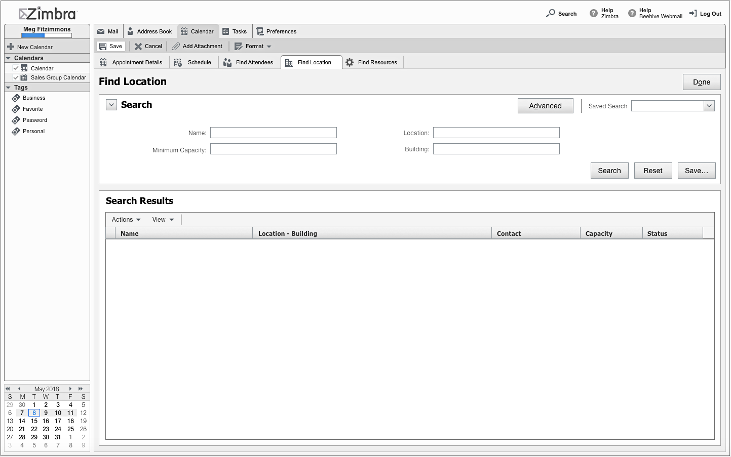
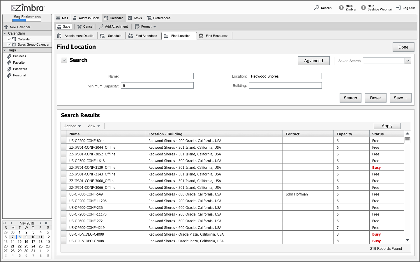
The current internal email and calendar system is being used by all 145K+ world wide employees. There are 100's of locations and 1000's of conference rooms in the location database. First time users would find a blank results table when they first access the Find Location page. It provides a simple form to enter data into four optional fields: Name, Location, Minimum Capacity and Building. It is a process of exploration and elimination as you start interacting with the form, entering known information such as the state or number of attendees. As you move through this process the inconsistency of conference room names and slow performance issues are frustrating. Each query can take upwards of 30 seconds to a minute to return results.
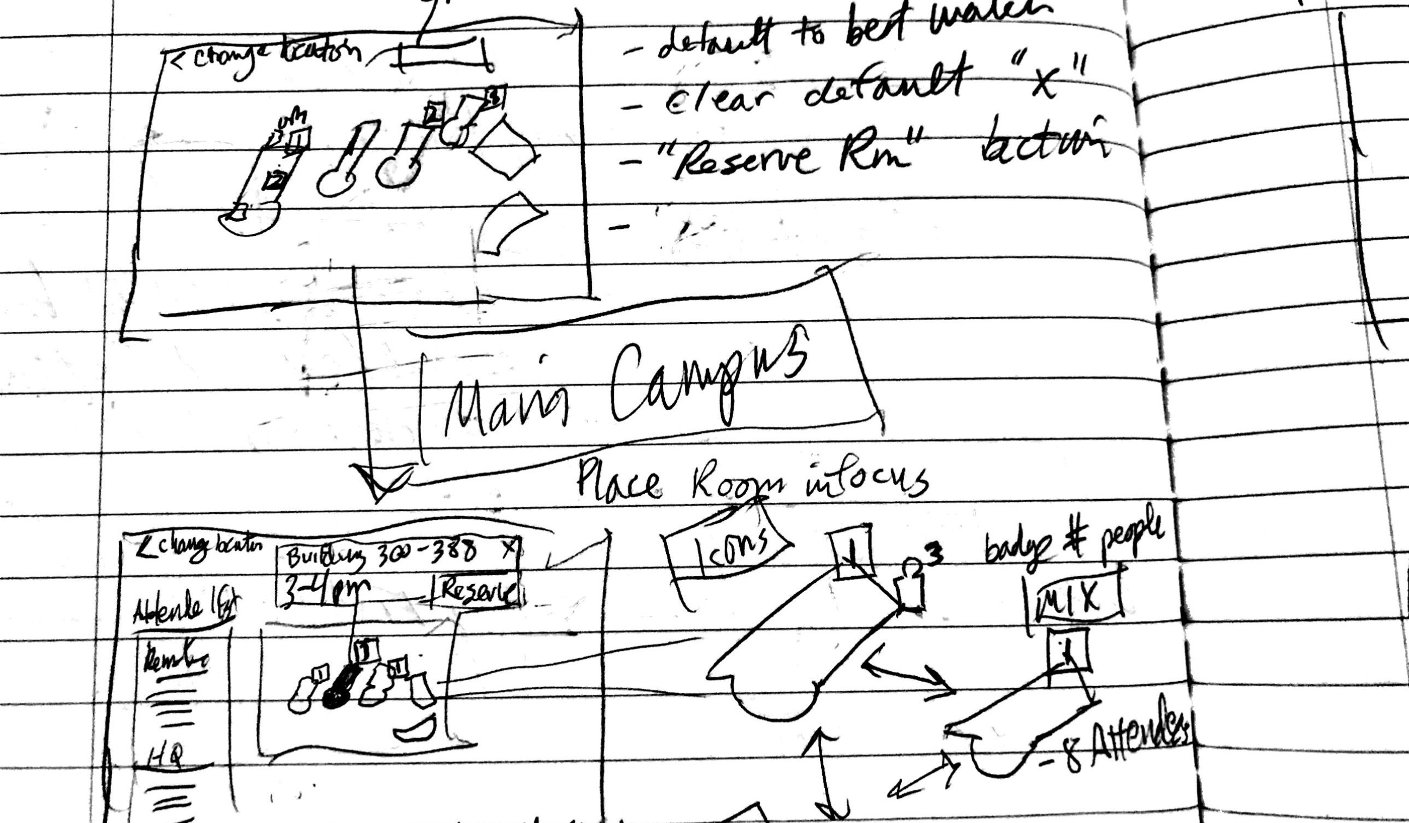
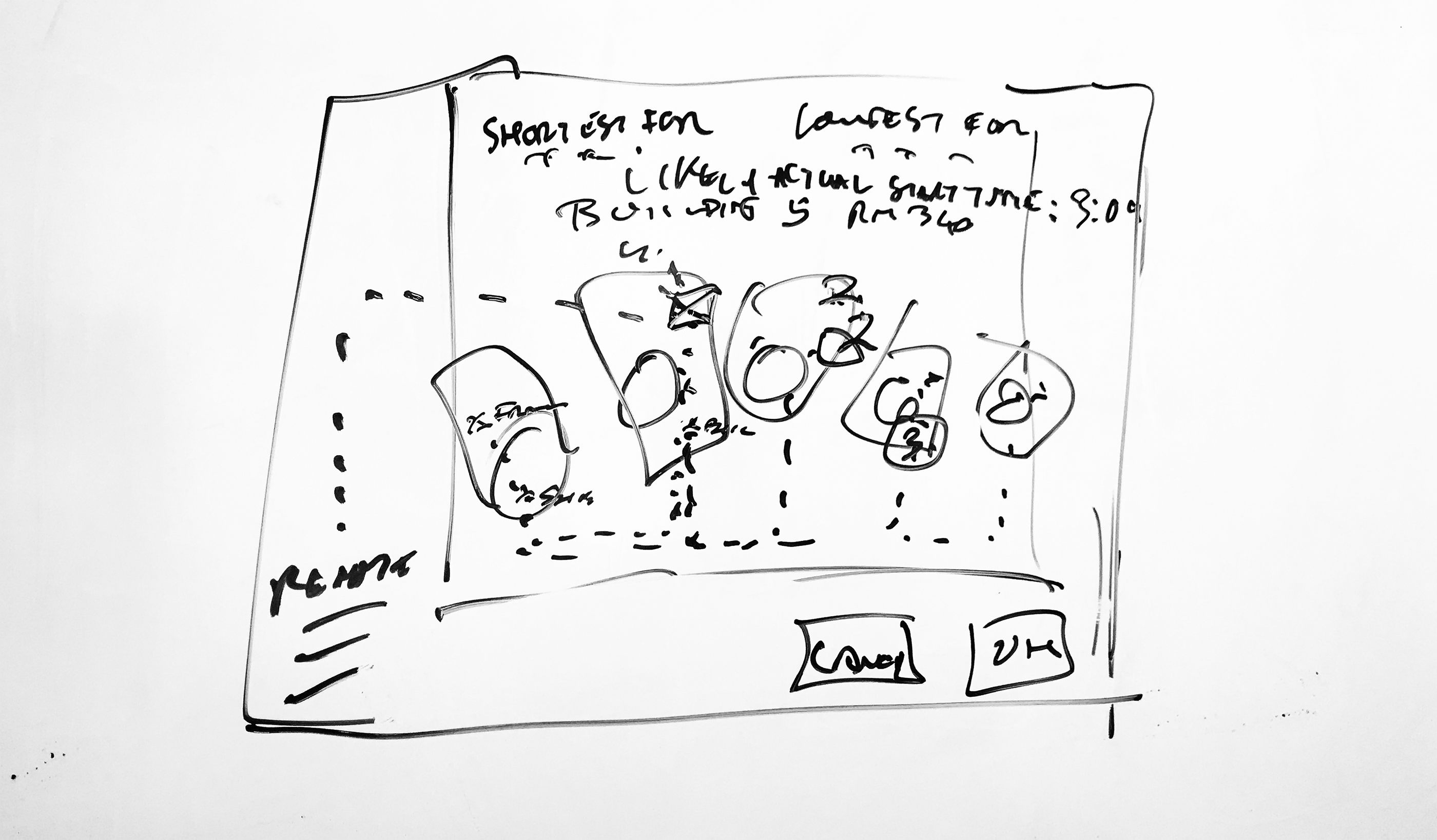
Initial Assumptions and Sketches
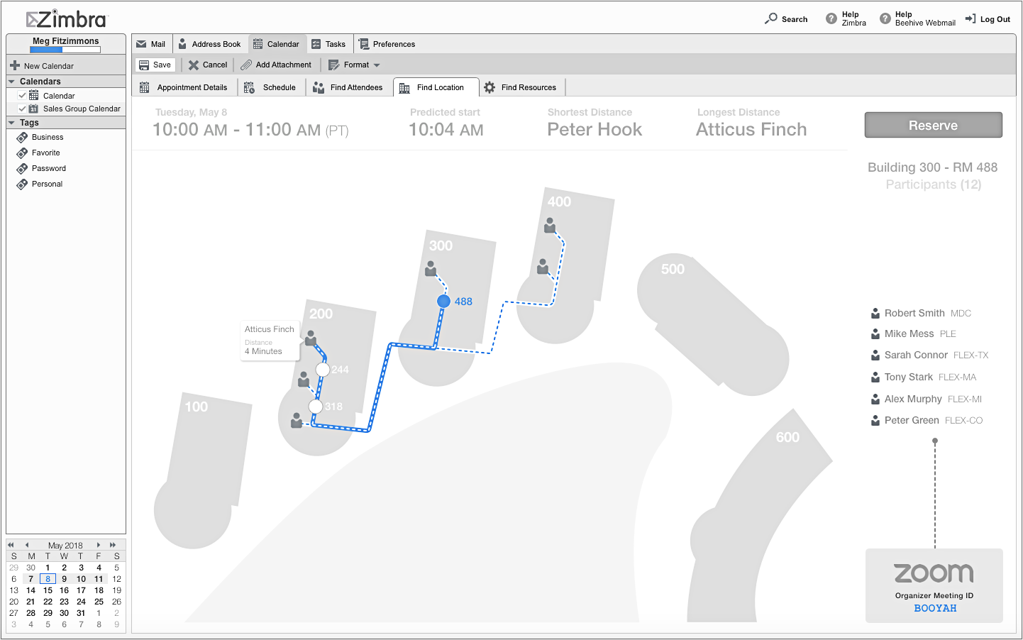
The new design needed to be innovative and simple. Since the calendar application has already compiled a large amount of data about the attendees, conference room recommendations should be easily determined. In addition, the system would know the relative distances between buildings and conference rooms. Using these inputs, the new design when loading the Find Locations page would present the organizer with a short list of recommendations. The system knows the desired start time, but then would be able to calculate an actual start time based off of the meetings and location of all attendees preceding the one being scheduled. The recommendations would handle multiple locations if meeting attendees were concentrated in two or more offices.
Design Directions
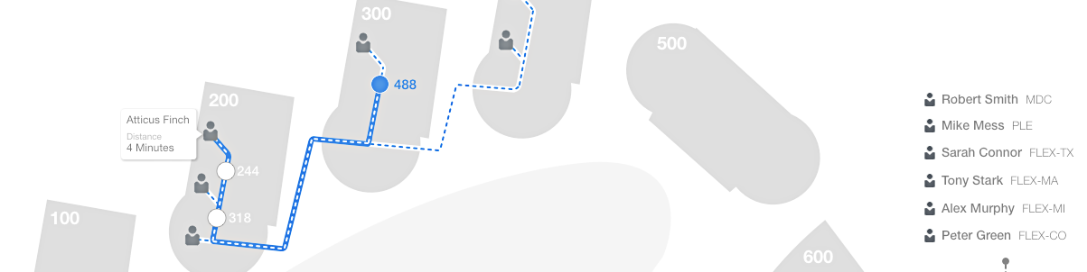
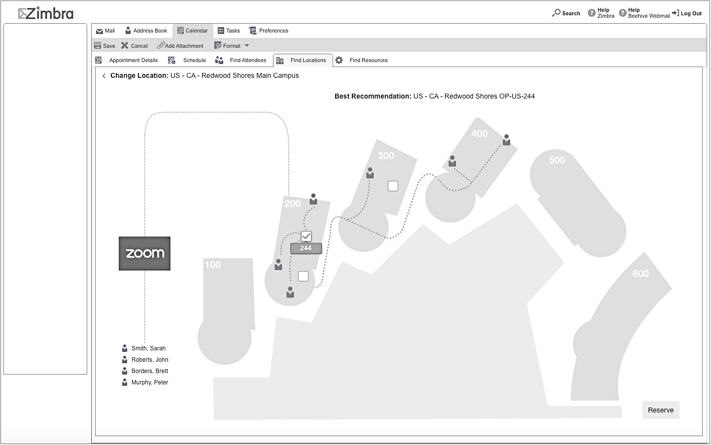
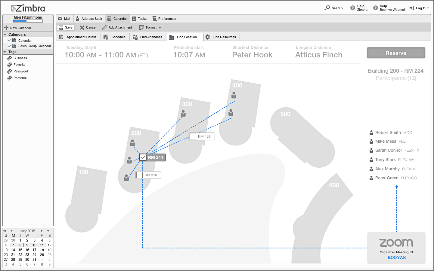
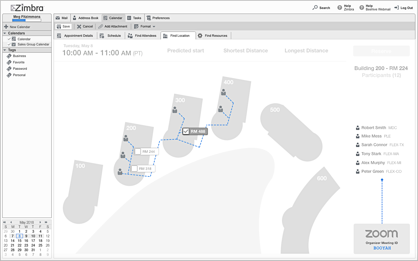
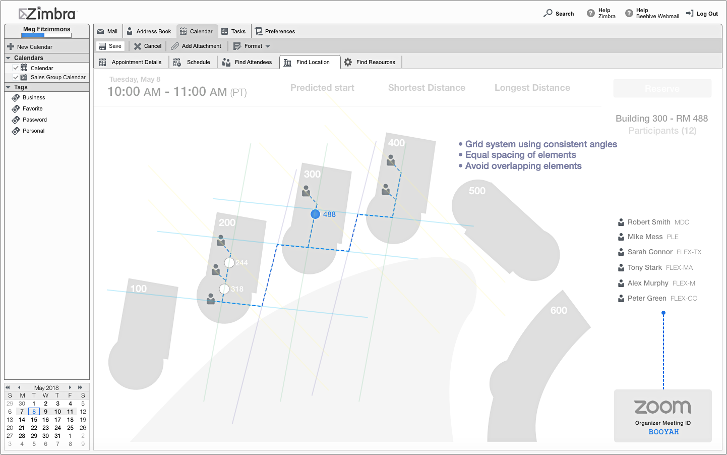
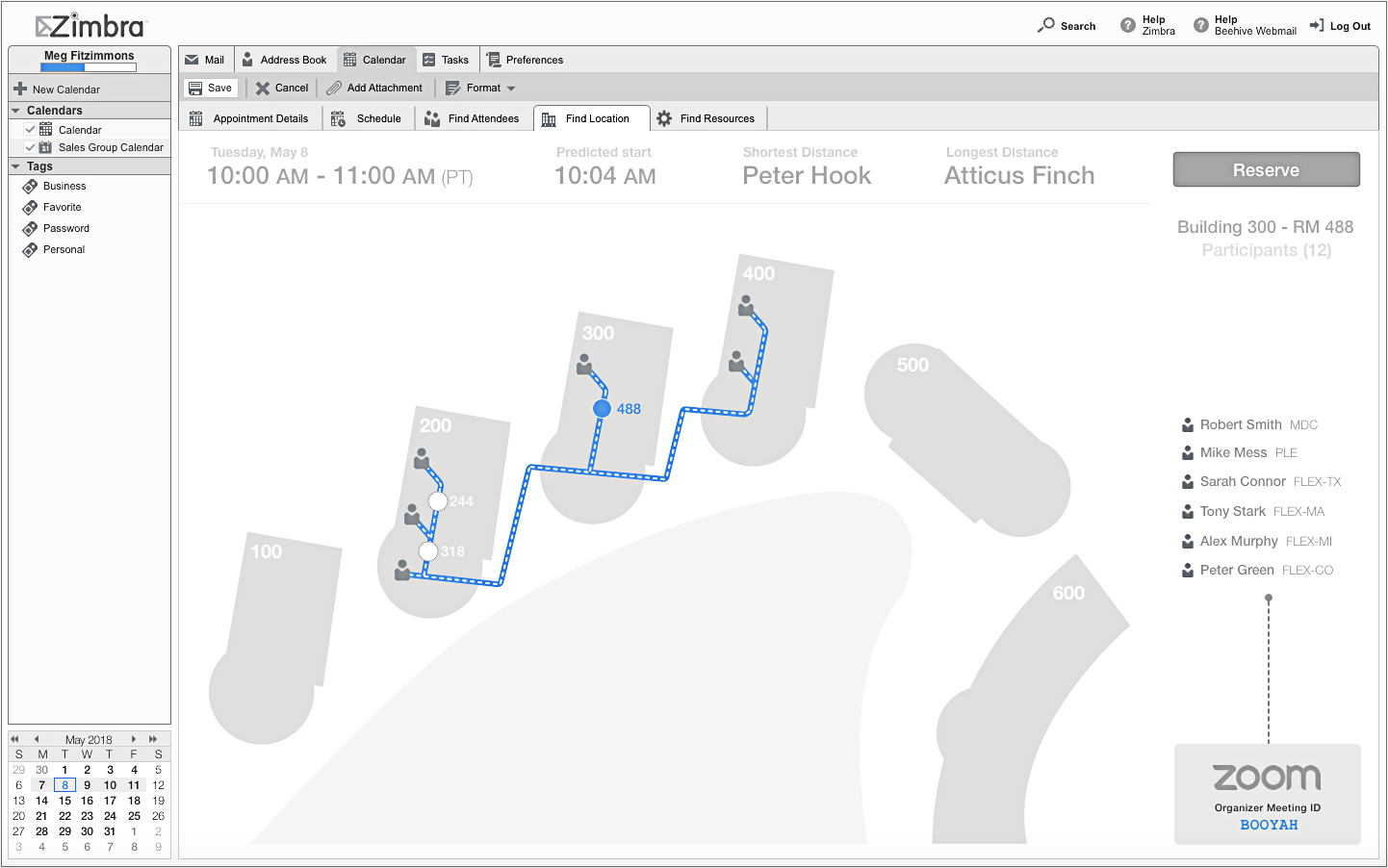
Using the chrome from the Zimbra web client, the design started out displaying a representation of the main corporate campus. The first iteration was a literal outline from Google Earth that was later simplified with enlarged buildings. Attention to details such as the primary data header labels above the campus map that start larger in size, and then resize as the data is populated. These are small design details that make for an impactful interaction design. Over several design iterations, new and improved paths between the attendees and the conference rooms were explored. The details about the path design and the angles used, the location of the attendee icons, the conference rooms were all rearranged around a system of consistency that reduced the visual clutter. The conference room representation was simplified to a round icon with two states, the room numbers were fixed to display on the right. The new layout system ensures maximum readability.
Final Design
The final design of the campus map, connections between recommended rooms and attendees was simple, clean and readable.
Presentation Video
Keynote was used to create the following prototype.
Keynote prototype recording
My Involvement
Research
Concept Development
UX Design
Visual & Interaction Design
Rapid Prototyping
Project Timeframe and Tools
Late April-Early May 2018. All the wireframing and design work was performed using Sketch.
The presentation was deliverd May 22, 2018.